|
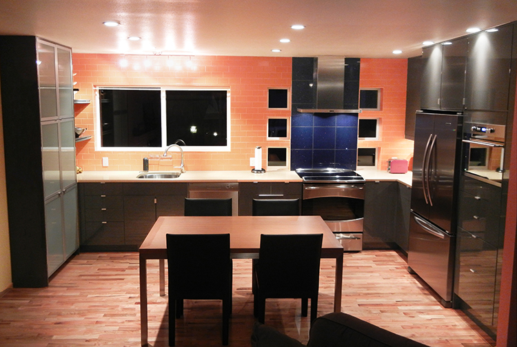
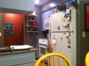
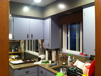
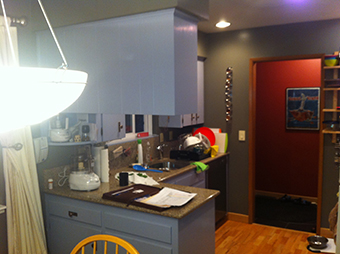
These home owners loved IKEA Abstrakt cabinets but they could not envision the cabinetry in their home. Before we even picked the cabinetry or color scheme the kitchen was designed with function and openness in mind. The kitchen before the remodel was small and closed in. They only had a 24" sink and no space to the left or right of stove to function well. The home owners were blown away by the open kitchen concept design coming to life. We removed two small walls that enclosed the kitchen from the rest of the home.


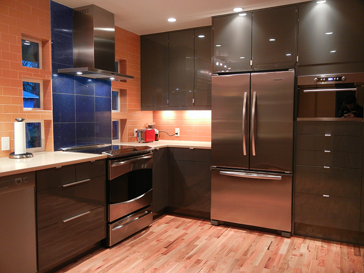
The color palate was pulled together by the home owner and tweaked by john to blend together. We added lots of can lighting to make sure the room felt bright and inviting. The home owner wanted an island but the space did not allow for a large island so we decided on using a custom made table that accents the floors and cabinetry.

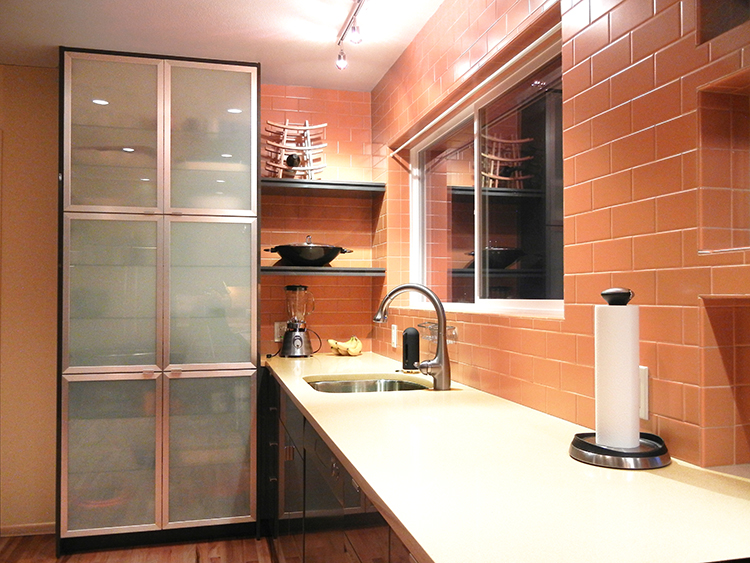
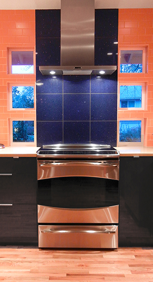
The windows were changed and added to let in as much light possible for Oregon wet and dark days. The niche windows to the left and right of the stove are John's signature look. They function as a great source of light and architectural detail. The window above the new sink location is the same window as before, but we raised it to be above the counter top level. New trim detail was added to outside siding of the home to make it look as if it was has always been a part of the home.

Kitchen Remodel Before Pictures


| 


